The Beginning.
To start things off, we're a small family-owned business based in Vancouver, British Columbia, Canada.
We've been selling liquid gym chalk for nearly 5 years and have loved developing relationships with gyms and retail stores across Canada and the USA. Providing a quality product that receives the accolades you've given us has truly made us feel loved.
We'd like to take you on a short journey of how we developed our brand (and logo, specifically), because we enjoyed the adventure so much.
------
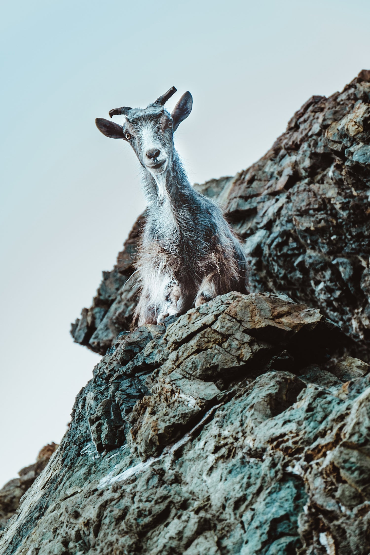
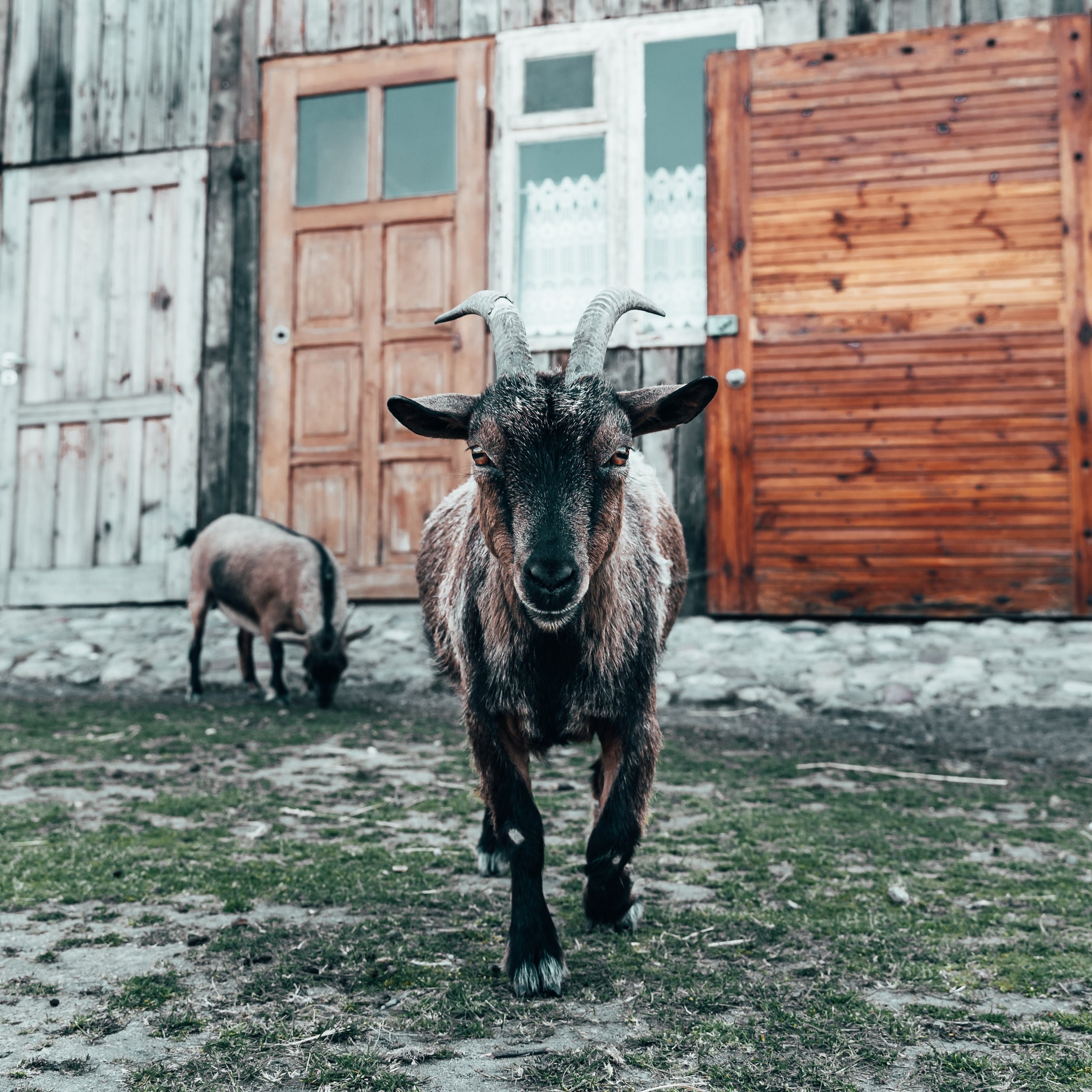
"Why a goat?"
We desired a business that pushed against the "snort protein powder and drink raw eggs" rallying cry of countless brands. We craved something less unhinged and more perseverant - something stubborn. We still wanted an animal to represent us - but gorillas, sharks and bulldogs weren't going to cut it. After researching several animals, the mountain goat felt like the perfect representation.
Goats scale cliff walls, sport goatees, head-butt things because they can, and eat kid's jackets.
More importantly, though, they have grit, tenacity, and stubbornness.
-
The Head.
After deciding on our mascot, a lot of thought went into designing the logo. We wanted to display a combination of the goat and how it manages to cling to cliff-sides.
We started with something simple - a goat's head.
-
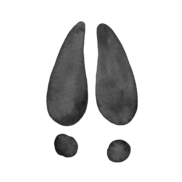
The Hoof.
We felt that a goat's head for a logo wasn't an elegant-enough design. We needed to connect it to the goat's hoof, bringing together the goat's tenacity with its grip. Their footprint was the perfect match.
-
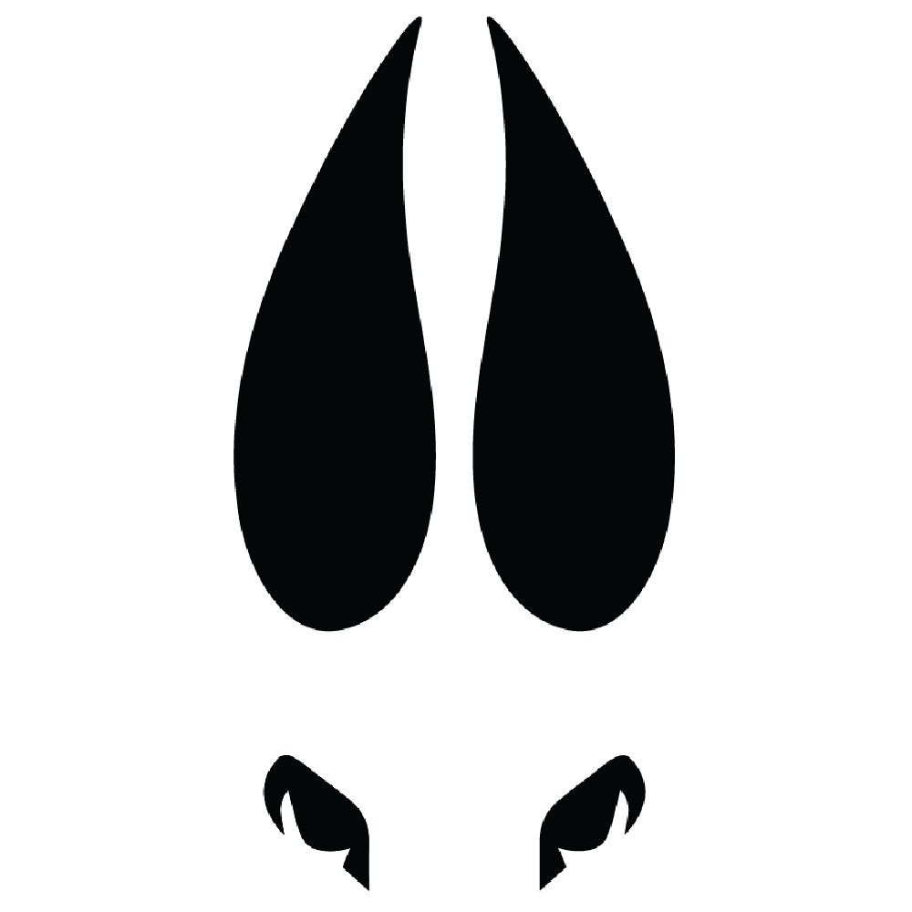
The Brand.
It may look simple, but it took a lot of attempts to get it just right. We only wanted viewers with a keen eye to stumble upon the duality of our logo.


